
Responsive website design and the 5 ways it improves SEO
Are you still confused as to why you should have a responsive website design for mobile devices? With 55% of worldwide traffic coming from mobile and more and more people purchasing directly from their smartphones, you will do yourself a disadvantage not to have one. Web design for mobile SEO is crucial for success!
Moreover, a mobile-friendly website has several SEO advantages.
In today’s digital world, people are constantly looking at their smartphone and tablet devices. So if your website is not optimized yet for any device, we urge you to do so.
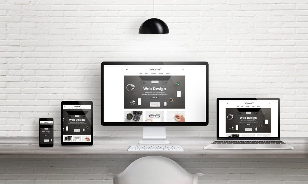
Having a responsive website and attractive design has become standard practice. No matter what business you work in, a responsive website is required in every SEO strategy to drive traffic and maximize your sales.
It’s a mistake to miss mobile in SEO site design.
Table of contents
WHY RESPONSIVE WEB DESIGN IS NECESSARY
Over the last year, the internet has advanced at an astonishing pace.
The use of smartphones has overtaken the desktop computer as the preferred method of accessing the internet for most people.
According to one study, smartphone users outnumber desktop computer users by a factor of two.
Neither of these findings should have come as a surprise to website designers or marketers.
The slowness with which business and the internet sector have responded to the new digital transformation and web usage is somewhat surprising.
Users expect mobile-friendly websites. Mobile-friendly is the new norm.
Miss to deliver on that, and you can be sure it will impact on your sales. Despite industry predictions, users’ desire for responsive web design has gone unmet.
Data shows that as many as 57% of internet users say they won’t recommend a business with a poorly designed website on mobile.
In addition, research shows up to 60% of people have not adjusted to the need for a responsive web design.
This is worrying for companies (not to mention the high numbers of web designers searching for employment at the moment).
Google was created with the end-user in mind — for people doing a web search. Google is adapting to the needs of people who access the web primarily via mobile devices.
That is why it would make sense that they prioritize websites that cater to Google’s audience specifically.
In other words, Google will give preference to mobile-friendly sites. Most of these sites have a mobile responsive design, which is what you want.
To enjoy the benefits of mobile responsive design on your SEO, here are five reasons why you should make the switch now.
1. A more user-friendly website

It is unlikely that visitors would stick around if your website is challenging to use and not optimized for users’ experience.
Search engine firms consider Google “time on page” an important ranking factor for every website. With a responsive layout, visitors have an easier time reading and navigating your website.
They spend more time on it and have a better user experience. This is key to getting people to want to know more about your products or services, and they will be more likely to buy.
Improved usability ratings result in visitors coming back and higher conversion rates.
This means a better ranking on search engines and more sales!
Google’s function is to answer users’ questions, as previously stated.
A good user experience begins with a mobile-responsive web design, and Google will reward those sites that deliver on that promise with a better ranking.
Website experience is a crucial component of white hat SEO and cannot be underestimated.
To increase conversion and improve customer experience, businesses and digital marketing companies must constantly be aware of this fast-changing digital world’s best practices.
The better the user experience, the more they will stay and explore your site.
This results in more traffic, positive reviews, and increased branded searches, all of which may influence search engine rankings. And behind all of that, there are the aesthetic aspects of a website’s design.
Web design for mobile SEO is the basis upon which all experiences are built and make a website successful online.
Increasing site usability with responsive design not only pleases users but Google often rewards it with higher search engine ranks, which is equally significant.
Put simply, if you want to win in the competitive SEO world, you must have a mobile-friendly and SEO optimized website.
To do that, we recommend partnering with the best.
This is what First Page Digital is.
2. A quick loading page
The time it takes for a page to load is a well-established website ranking factor. Design your website, so the pages load as rapidly as possible to increase the likelihood of ranking high in search engine results.
Let’s be honest. Who likes to wait for a page to open?
Google’s message has been clear for years: fast-loading sites perform better in search.
Another reason Google rewards responsive website design is that it is more user-friendly.
Faster-loading websites (particularly on mobile and smart devices) provide a better user experience and a possible ranking increase for mobile responsive.
Having a web design for mobile SEO and user-friendly for desktop and mobile leads to more satisfied users and more sales!

3. A decrease in the bounce rate
The bounce rate is the number of users that visit a page and close without taking action.
Proportional to the amount of time a user spends on a page. In what time frame do your website’s visitors go back or leave? When it comes to a website’s entrance and departure points, Google considers user behavior.
Leaving a site nearly as fast as you arrived might be seen by Google as an indication that the material the searcher discovered on your site was not relevant to their requirements.
The website’s rating in Google search engine results for that inquiry will be lowered as a result. Users, on the other hand, aren’t only concerned with the content.
In many cases, it’s possible to say that design triumphs over the content.
Users will quit a site even if the information is excellent if the design makes it difficult to understand.
Using a mobile responsive web design, you may not only provide relevant material for users to utilize, but you can also show it in a mobile-friendly manner.
It delivers a distraction-free browsing experience for your website’s visitors.
4. Fewer Repetition Issues
Even though Google’s algorithms are pretty sophisticated, you must still tell them which information on your website is the most significant.
It is tough to deal with duplicate content concerns while creating a separate mobile site. When you have a mobile-specific website, you must have a unique URL for it.
Even if the URLs are different, the content on desktop and mobile is the same. The same material may harm your search engine results.
If you do not tell Google which material is most important and guarantee that it gets indexed, the decision will be made for you.
The end outcome is nearly always a drop in search engine ranks.
Another advantage of a flexible design is that you may concentrate your SEO efforts on a single site rather than many ones since distinct mobile areas are cannibalized to their desktop versions.
Duplicate content issues may be addressed with a mobile responsive website. No matter what device is being used to access the information, write a single URL.
5. Enhanced Social Networking
Mobile users are the most prevalent population on the internet, and responsive web design was created with them in mind.
Even while social media may aid SEO, it will have no direct effect on search engine results if you use it. However, it will aid in the expansion of your fan base.
More significant numbers of people may imply more traffic and interaction for your business.
This will raise the profile of your site on search engines like Google.
Users who visit a website on their smartphones will have difficulty navigating clumsy and poorly designed social sharing buttons on a desktop version of the site.
PREPARATION: KEEPING MOBILE USERS IN MIND WHEN DESIGNING YOUR PROJECT
Before you begin developing your website, it pays to mind map your SEO strategy and spell out the website’s goal and purpose.
You will have a more condensed and sensible mobile responsive site design if you prepare ahead of time.
By creating the strategy ahead of time, you will be able to determine the correct vocabulary to use for your company, website, or service and the right content to include to provide your target audience with what they need.
It also gives you time to do your keyword research properly and make your website design and content mobile-friendly.
The clearer you are on your objectives, the better results you will get.
To build a strong SEO strategy for your website, and do web design for mobile SEO, you need to know your target audience pain points. Your messaging must be addressed to them directly.
Conclusion
Having an SEO responsive and mobile-friendly design is key to improving your business’s online performance, attracting leads, building your authority, and increasing your revenue.
If you need help with SEO and your website design, book a free call with one of our digital specialists today.
What else apart from good mobile SEO can drive traffic and sales?
Want to drive more traffic and sales? Here are some useful marketing tactic blogs. You can combine them with your newsletter execution. We invite you to read the following:
- Perfect Your Email Marketing Strategy Now
- What Are The Top Ppc Ideas You Ought To Know?
- Social Media Strategies: Successful Ones You Can Learn From
- Helpful Content Tips: Get Noticed Before The Competition
- 6 Easy Digital Marketing Hacks To Increase Your Leads
Are you a busy business owner? You may not have the time to run the marketing tactics you need to make money regularly. If this is the case, we encourage you to review some of our strategic marketing services to drive more sales:
- SEO for your business to drive qualified leads
- Social media management for improved brand awareness
- Linkbuilding to drive organic traffic to your website
- Top converting landing pages to convert your leads
- Email marketing campaigns to bring in referrals