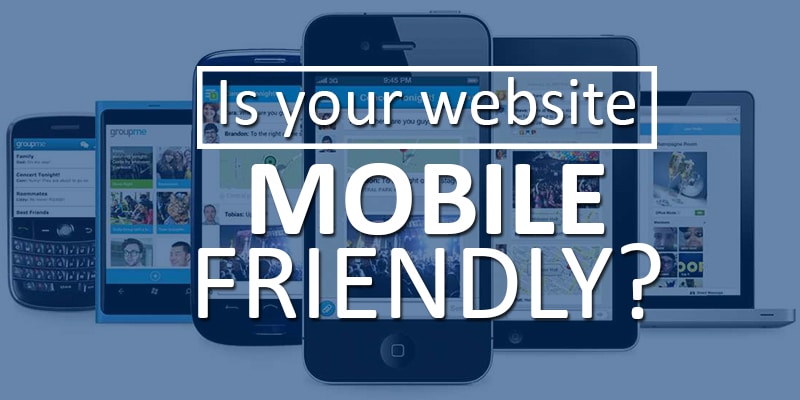
Simple Tips to Boost Your Sales with a Mobile-Friendly Website
Mobile Internet usage has surpassed desktop usage, and it looks like every day people move further away from desktop computers. Various surveys show that about 62% of smartphone users regularly make purchases through their devices. People even use their mobile phones to check product reviews and compare various products while they are actually inside a store.
Therefore, developing a mobile-friendly website design is the key to your success, especially if you run an e-commerce business. The following tips will help you understand the most important features of this website.
Use adaptable web design solutions
Smartphones aren’t the only kind of mobile devices you need to keep in mind when developing this kind of design. Mobile devices also include tablets and netbooks. In addition, you shouldn’t forget that the size of the screen and other tech specifications of the gadgets vary greatly. To achieve the best results, your website design must cater to the needs of every prospective customer, whether they are using an old Android 3.5’’ smartphone or a 13’’ tablet.
As there isn’t one size that fits all, you’ll need to use adaptable website design that will ‘reform’ the website depending on the device used to access it.
Choose mobile website over an app
Many businesses develop specialized apps to allow mobile users shop in their online stores more efficiently. There are some benefits to this approach, but in general, it’s not the best strategy to use. Apps, no matter how attractive, are very limited. A customer needs to install it on every device separately, which takes time. There is also an issue of optimizing your app for different systems (iOS, Android, etc.).
All in all, a mobile-friendly e-store that runs equally well on any gadget is guaranteed to generate more sales than a specialized app.
Test your mobile website for ‘tap friendliness’
It’s essential to test your mobile website design from different gadgets and check how easy tapping is. Unresponsive, inconveniently located, or too small buttons make it difficult for your customers to make a purchase. This inconvenience will drive them away immediately.
Always double-check every feature of the website and fix any issues right away to maintain a good profile with your customers.
Simplify the checkout procedure
If you aim to drive e-commerce sales with your mobile website, you should make the process of purchasing as simple as possible. Streamline your checkout by using a One Click Purchase feature or putting all the necessary checkout forms on a single page that can be scrolled down.
Adaptable mobile-friendly website will help you increase the number of conversions from visitors to customers. Remember that simplicity and efficiency is best when dealing with mobile web design.
Last reviewed and updated on 08/09/2025.