8 Ingredients For Powerful Landing Pages
As the name implies, landing pages answer web searchers’ questions the moment they “land” on the page. But what ingredients make a great landing page?
On the customer’s side, a useful landing page gives them the information they were searching for in one place. On the company’s side, a landing page drives customer contact and sales to their business.
A persuasive landing page can mean the difference between a 2% and 10% conversion rate. That might sound like a small number, but it amounts to big bucks down the line! Here, we outline the main components of a powerful landing page, so you can enjoy more conversions and customer contact.
1. Don’t Use Your Home Page!
A rookie mistake when it comes to landing pages is to use your home page instead. It might appear to make sense at first, given that a home page is designed to act as a summary of all your offerings rather than just one. But this is not the case!
Landing pages are created to efficiently deliver information. Home pages are not. The amount of navigation required to find a particular piece of info with a home page as your starting point is much, much greater – and that leads nicely into our next point.
2. Streamlined Navigation

Only 16% of landing pages have no navigation. That figure is far too low. Effective landing pages have as few links as possible, driving visitors down the page towards your call-to-action (CTA).
Embedding excess links into your landing page only serves to divert visitors away from it, decreasing the likelihood they’ll convert. Keep your visitors focused by streamlining visitors’ navigation toward completing the desired objective.
3. The Winning Format Formula
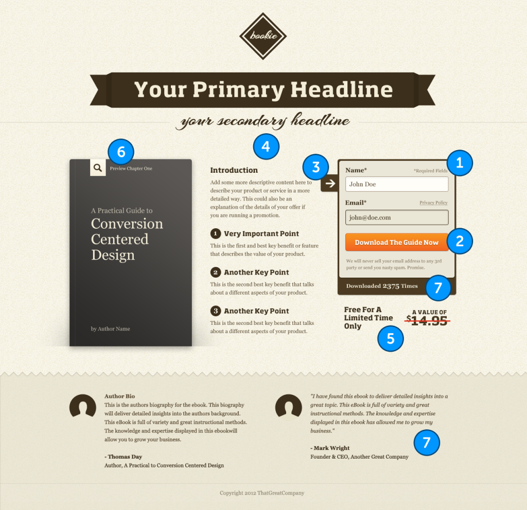
Adhering to an appealing format style is vital for securing conversions from a landing page. Starting with a strong header and sub-header, landing pages should showcase at least one relevant image or short video to support the description of the offer.
Other features to consider include customer proof elements. These could include testimonials, logos or security badges, for example. The most crucial ingredient in your flawless format formula is, far and away, the lead-capture form to accrue information.
4. Compelling Copy

90% of visitors who read headlines also read CTA copy. This puts persuasive, impactful headers and CTAs at the top of the hierarchy for landing page content.
That said, the content in-between the header and CTA matters too. While short-form content is punchier, longer landing pages generate 220% more leads than those with CTAs above the fold.
Make sure all content on your landing pages is value-adding, containing no “filler” for the sake of bulking up word-count. Visitors will only convert if you give them a good reason to!
5. Keep It Clear

48% of landing pages contain multiple offers. That’s far too many. Landing pages should tout a single clear objective, rather than confusing the message by urging multiple actions.
Avoid distracting visitors with too many prompts and too much information. There’s elegance in simplicity, and landing pages need to exemplify this concept in every respect – from copy, to design, to CTAs – in order to be effective.
6. Ask Only For What You Need
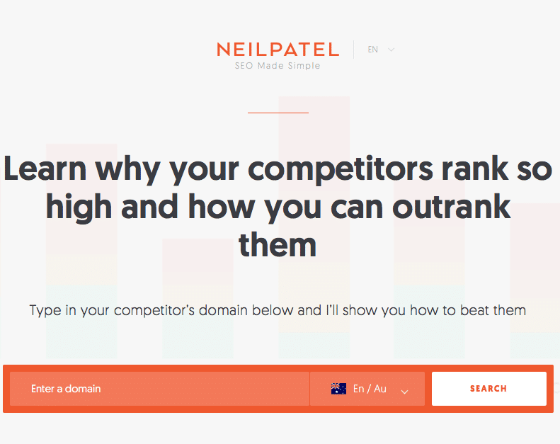
SEO Guru Neil Patel provides consistent examples of great landing page techniques.
Asking for too much information, or info with questionable relevance will deter visitors from filling out your all-important lead-capture form.
Visitors might not feel comfortable providing personal information, even if you’re asking purely for data collation purposes. Streamlining lead-capture forms into containing as few fields as possible to obtain desired information is more effective in achieving conversions, which HubSpot has proven in their studies.
7. Create Specifically For Mobile
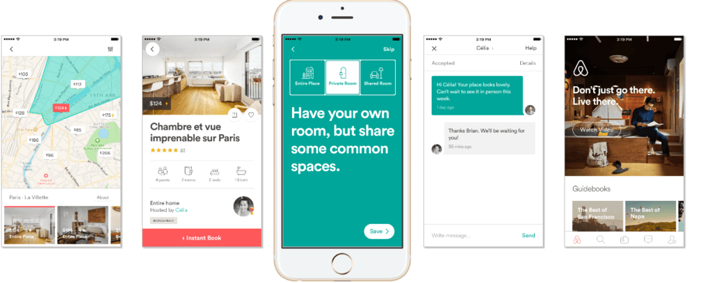
When it comes to mobile landing pages, Airbnb has nailed it.
The mobile-first era is here to stay. That means every element of your online presence must be optimised for mobile, including your landing pages.
There’s clear merit to going one step further, by creating dedicated landing pages for mobile instead of simply optimising for mobile.
Evidence suggests that mobile conversions lag behind desktop, largely because not enough landing pages are specifically engineered for the format. Because mobile-specific pages have been found to convert better compared to optimised desktop pages, it’s wise to include this in your recipe for the perfect landing page.
8. Create A Landing Page For Each Campaign

There’s no such thing as a “one size fits all” landing page. To be as powerful as possible, each campaign your business runs should have a corresponding landing page to suit.
Statistics show that using the right types of testing and targeting on your landing pages can bolster your conversion rate by up to 300%. This meshes seamlessly with your pay-per-click (PPC) campaigns: for instance, for each Google Search Ad group you have, those who click on the ad will be directed to a specialised landing page.
It’s easy to get lost and confused, overcomplicating the formula for an effective landing page. But if you keep the visitors’ questions at the forefront of your mind and enact these 8 tips, we’re sure you’ll achieve more conversions than ever before.
Now you have the recipe and all the ingredients, go forth and cook up a potent landing page that’ll knock your visitors’ socks off! If you’re still unsure why these conversion-driving pages are necessary at all, take a peep at our previous blog outlining 4 Reasons Why Your Site Needs A Landing Page.
Last reviewed and updated on 08/09/2025.


